Creating a Scrolling Marquee with HTML and CSS
8th May 2024

Hand-coding a marquee component from scratch
I’ve been on a mission to complete tasks from Daily UI. I started doing these challenges when I went through a career change, learning to be a web developer. These challenges, along with other things, must have really done the trick because I’ve been so busy in my career that I haven’t been able to complete all 100 of these challenges in years*!
*There were several reasons that I haven’t completed the Daily UI tasks but one that comes to mind is that I wasn’t a huge fan of having 100 different, independent GitHub repositories. Organization was a blocker for me. With the recent development of awesome front-end frameworks such as Svelte and Astro, I saw the opportunity to house all my projects under one main project. So far, I’ve been happy with the results.
I needed to build a landing page
The Daily UI task that I decided to focus on this time was creating a landing page. There are plenty of great landing pages on Dribbble but I wanted to create one that was visually appealing, different from what I normally do, and had elements that I would find interesting to develop.
The design I found was this one:

I found a fun but complex design
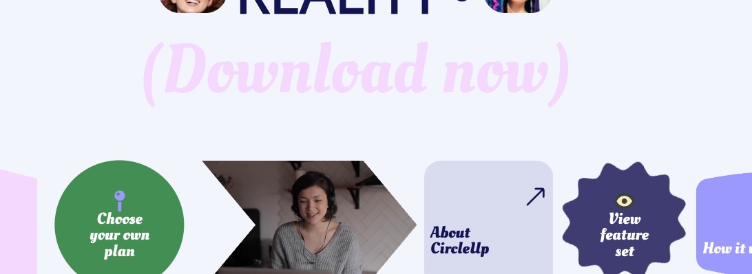
The design had familiar elements such as the navigation and hero but the scrolling marquee at the bottom is what caught my attention.
I did some research to help me build the scrolling marquee
To develop the marquee, my thought process was the following:
- Build the basic shape content containers with divs with flexbox
- Figure out the right to left scrolling of the divs
- Research how to fit the content in the different-shaped containers
- Apply animation to the appropriate content containers
The basic shape of my marquee:
<div class="marquee">
  <div class="marquee__content">
    <div>Item 1</div>
    <div>Item 2</div>
    <div>Item 3</div>
  </div>
</div>
.marquee {
margin-top: 40px;
display: flex;
gap: 0.5rem;
overflow: hidden;
position: relative;
}Once I built the basic shape, I needed to scroll marquee__content. To figure this part out, I employed this video that was quite helpful in getting me to this:
<div class="marquee">
  <div class="marquee__content scroll">
    <div>Item 1</div>
    <div>Item 2</div>
    <div>Item 3</div>
  </div>
  <div class="marquee__content scroll">
    <div>Item 1</div>
    <div>Item 2</div>
    <div>Item 3</div>
  </div>
</div>
.marquee {
margin-top: 40px;
display: flex;
gap: 0.5rem;
overflow: hidden;
position: relative;
}
.marquee__content {
flex-shrink: 0;
display: flex;
justify-content: space-around;
align-items: center;
min-width: 100%;
gap: 0.5rem;
}
.scroll {
animation: scroll 15s linear infinite;
}For the different shaped containers, all I needed to do was figure out the layout on one of the content containers then repeat.
For the shape of the container:
// Accordion.svelte
<svg xmlns="http://www.w3.org/2000/svg" fill="none" viewBox="0 0 200 200">
  <path
    fill="rgba(245, 215, 254, 1)"
    d="M0 45.736 50 33l50 12.736L150 33l50 12.736V168l-50-12.736L100 168l-50-12.736L0 168V45.736Z"
  />
</svg>
For the layout of the content within the container:
// Collaborative.svelte
<script>
  import Accordion from "./Accordion.svelte"
</script>

<div class="marquee__item marquee__item--accordion">
  <div class="accordion__container">
    <Accordion />
  </div>
  <h3 class="marquee__text">Collaborative</h3>
</div>

<style>
  .marquee__item--accordion {
    position: relative;
    height: 200px;
    width: 200px;
  }
  .marquee__text {
    position: absolute;
    bottom: 25%;
    left: 50%;
    transform: translateX(-50%);
    color: #3f3a72;
    font-family: var(--header-font);
    line-height: 1;
  }
</style>
Lastly, I needed to get the containers that are spinning infinitely, to spin:
.spin {
  animation: spin 5s linear infinite;
}
@keyframes spin {
  from {
    transform: rotate(0deg);
  }
  to {
    transform: rotate(360deg);
  }
}
I ended up with a slick looking scrolling marquee
Using this methodical approach, I was able to create the scrolling marquee, look at the final result
